I’ve been shopping for a lot of software lately, for the big changes coming in Breakthrough Marketing Secrets…
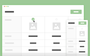
And I almost always end up on the product and feature comparisons page, that looks a little something like this:
Most services have it to compare their different account levels (e.g. free, pro, business). You can call this an internal product comparison table.
Some are also using it to compare their own products and services to their competitors’. You can call this an external product comparison table.
Both have a TON of value for me and you, the shopper. And for the most part, if you can make it relevant to your selling message, you’ll find it is a good way to increase conversions on your website.
Since the actual process of creating one is pretty technical and basically involves finding one you like and copying it, I’m not going to go to deep there. But I do want to look at the two types of product comparison table, along with the principles, strategy, and psychology behind them. That way, if you’re finding a way to work them into your marketing, you’ll have the thinking right to use this tool to best effect.
How to use an internal product comparison table to help your prospects find which of your products or services is the best fit for them…
You’ve seen these before. For example, Dropbox has one. So does Netflix. One of them I’ve been checking out recently is Wistia.
These apply in any business where you have different levels of product or service that would tend to be compared to each other, for the customer to find the best fit for them.
There’s a strategy I learned from Dan Kennedy called “Find yourself here.” It’s especially relevant to this product comparison table type. Though it applies across the board.
By the time a prospect hits one of these comparisons, they have a pretty good idea that they want your product or service. Or would at least benefit from it, and so are shopping seriously. They’ve seen a lot of the features you offer, and have some ideas about what they want to use.
For software-as-a-service (SAAS) providers or others that bill on usage capacity, they probably also have a pretty good idea of what their capacity need is going to be. (For example: how much data you need to store in a cloud storage service.)
So they’re coming to the comparison with an idea of the features they want to use, and the usage capacity they expect to need.
Here’s where find yourself here comes into play. The customer looks through the product levels. They look at what features each level contains, how much usage it makes available to them, and what the best fit will be.
What they’re trying to find is the level of the service that best fits their individual needs.
The closer the match is between what they need and what the product or service provides, the easier it is to make a buying decision.
And here’s the tricky part. You don’t want to give them too much. Though we often value quantity and that leads us to want to pile on features, that’s not necessarily what the customer wants. The customer wants best fit, and that’s where they’ll get the most value.
The question then becomes: What’s the minimum feature set we can include to capture all customers at this level?
You want the reaction to be, “This is exactly what I was looking for!” A few useful bonus features or a bit of excess capacity are a plus. But they don’t want to feel like they’re paying for things they don’t need. That actually makes it harder to make the buying decision, not easier.
At the most basic level, we all want to feel like we’re getting exactly what we need at the best possible price. If your product comparison table does that for the maximum number of prospects, it will be doing its job.
But there are two other things you can do with an internal product comparison table, that make it even more effective.
The first is price justification. By comparing levels of product or service side-by-side, you make it easy to see what the prospect gets by choosing a higher level of the product. This helps them understand why they will get more value from the higher levels. And if that value would be useful to them, it can drive them to upgrade.
The second is that it allows you to feature a specific product level. Unless you suggest otherwise, the default shopping behavior will likely be to find the lowest-priced level that has at least the minimum feature set. But a funny thing happens if you highlight one of the columns as your “Most Popular” or “Best Value” or somehow or another make it the preferred option. More people will choose the preferred option. This is a form of social proof — if you think it’s good, or if other people think it’s good, it must be good. If you want to drive sales of a higher level that does indeed provide a best fit for the most prospects, this is a highly-effective way to do it.
Now onto using product comparisons to compare yourself to the competition…
How to use an external product comparison table to help your prospects choose you over other options available to them in the marketplace…
The single-most powerful question in business is, “Why should I, your ideal customer, choose you over every other option available to me in the marketplace, including buying from competitors, solving the problem myself, or doing nothing at all?”
The answer to that is your Unique Selling Proposition. And although your Unique Selling Proposition should be able to be captured in a concise statement, the product comparison table provides excellent justification for the claims you will make.
The concept is largely the same. You’re comparing feature sets, capacity, and pricing. But here you’re comparing your own service to another option, from another competitor.
Here’s where this can get really powerful.
What you’re selling probably has a pile of advantages over the competition. And what they’re selling probably has a pile of advantages over you.
For example, when I sold IT training, our training’s advantages were the extensive catalog, from really high-level trainers, that felt personal like a friend was sitting by your side and walking you through what you needed to know. But our training was ugly and wouldn’t present well in a corporate boardroom. Many of our competitors had less esteemed instructors, with a smaller catalog, and it was presented in a way that was presentable to corporate but probably harder to stay engaged with and learn from. (And this is just scratching the surface.)
Our external product comparison table would be built to highlight our training’s best features. And theirs would be built to highlight their advantages over us.
As a prospect was shopping between options, they could look at our comparison, and look at others, and figure out where their priorities were, and which option would be best for them.
I think a good external product comparison table should definitely disqualify some prospects who find it. Your product is not right for everyone. Some people will prefer your competition. Your comparison should highlight at least one or two advantages your competition has over you in the eyes of certain buyers who would not be a good fit for you. Unless you have a specific strategic reason otherwise, your product comparison table should probably make 80-90% of the viewers prefer your product. But it will be made all the more believable and helpful by weeding out the 10-20% who are not a great fit.
Along with this, you’re also setting expectations. If someone can clearly see where your limitations are, they won’t be upset to run into those limitations after making the purchase. You’ll save on customer service hassles and churn, by having more qualified and better-educated customers. This will only help you.
Finally, external product comparison tables should probably NOT be on the front page of your website. If you’re second in the market and you want to go up against the entrenched leader, that might be the exception. But for the most part, you want to keep these buried deeper in the website, to be discovered by anyone who is looking.
The reason here is that you don’t want to be sending people away to your competitors from the moment they land on the site. You’re better off letting comparison shoppers find the external product comparison table through Google, or even through a site search on your site. (These are great for SEO, as evidenced by the fact that I keep finding them in my searches!) The prospect is trying to compare your solution to the competition, so you want to give them that tool. If someone isn’t already comparing you to an alternative solution, you don’t want to lose them by introducing the idea.
Big takeaways…
First, a product comparison table is a powerful tool. I think a lot of businesses can benefit from both the internal and external types, used in different places and for different purposes on their site.
Second, get the psychology right. You’re trying to provide value and help the prospect make their buying decision, with your best potential customers favoring your product over the competition.
Third, remember that fit is better than quantity. Your prospect wants to find the best fit for them, and whether you’re comparing internally or externally, getting that right will be the key to converting them to a customer.
Now go put this to work and see what kind of conversion breakthroughs you can come up with!
Yours for bigger breakthroughs,
Roy Furr