I just read a great article from Noah Kagan, on Aweber’s web site.
It was about 7 data-based list-building tips his companies have found from getting over 1,000,000 email sign-ups.
Specifically, “rules” for getting higher conversion from your email pop-ups.
You probably already know I love testing-based posts like this.
Noah and his team have so much volume and data — across multiple sites, in multiple industries — that they’re able to establish baseline “best practices” that can give you good testing points to improve your own results.
Studying, learning from, and using other peoples’ test results is a shortcut method you can use to make yourself competitive, fast.
It won’t necessarily give you the total breakthrough above and beyond what everybody else is doing — but it will get you up to speed.
Anyway, there were a few things that jumped out at me in particular. Not huge surprises — but good reminders.
I’ll run through those points, and then tell you how I’m currently getting 104.8% HIGHER email opt-in rates than what Noah and his team say is the average conversion rate for these things.
Point 1: Showing your form more often gives you more sign ups…
We all hate the idea of abusing our website users by showing them the opt-in form over and over and over again. But the data suggests that if you ask for the email every time someone visits your site, or every month, you’re going to get more sign-ups.
I currently only show it one time. I don’t know that I want to switch to every visit. But perhaps monthly or quarterly.
Point 2: Showing your form 5 seconds in is a “sweet spot” for conversions…
This gives the visitor time to start engaging with the site, but isn’t so long they’ve already clicked away.
This actually runs counter to my recommendation, but it’s worth thinking about. Timing matters.
Point 3: Classic marketing motivators work…
After a bunch of testing, they found that social proof, free gifts, and retail discounts are great things to present as reasons to opt-in.
Human nature hasn’t changed since the earliest marketing and copywriting books were written — and it’s unlikely to change any time soon.
Use the classic motivators recommended by Caples, Schwab, and others, and you can get response online, too.
Point 4: Color matters…
As a general rule, red buttons perform best.
There was also an interesting point made about “contrasting color.” This is what I think most about when designing a web form. In a site that’s all red, you don’t want the form and the button to be red, too. You want it to stand out as a point of focus on the site. So if your background is red, maybe your button is green or blue.
Point 5: Copy on the button matters…
Of course, copy everywhere matters. Folks don’t opt-in to an email list just because they like the design of the web form. But the button is a point of decision — the final place where the website visitor has to take action before the “conversion.”
Benefit-oriented and action-oriented copy will seal the deal. It’s about what they get for clicking the button, or their request for your action. “Get Great Stuff” was an example. Also, “Send Me Free Tips!”
The idea is that the button itself shouldn’t be about the form (i.e. “Submit”) but about the transaction taking place between you and the site visitor.
There’s more, but you’ll have to read Noah’s article.
Now for my secrets to 104.8% HIGHER opt-in rates…
As part of the article, Noah said that across audiences and industries, the average conversion rate for these pop-ups in 1.66%.
Wanting to know how I stacked up, I checked the pop-up that I run on the Breakthrough Marketing Secrets site.
It’s getting 3.4% — 104.8% higher than the average!
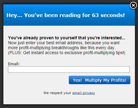
Here’s what it looks like (and note this is NOT a real form, so don’t try to enter your email address)…
And I should note…
This form is NOT the result of a bunch of testing.
In fact, it’s the same form I threw up on the first day or so after starting to write these daily articles. (Oops, I admitted to bad practice!)
So why does this rushed, ugly, not-best-practices form convert at more than double the average?
One of the most important principles in copywriting is to enter the conversation already going on in your customer’s head.
This form is the perfect example of that, applied to an article reader online.
Note that it says 63 seconds on the form. I wanted an odd number for that, because in general odd numbers are more interesting than even or round numbers.
But Noah said 5 seconds was best, right?
Well, he may be right. But I chose a much longer time frame because I wanted the viewer to start to judge the article quality for themselves. I believe in the value of my content, and I want the reader to like it first before I ask them to opt in for more content.
By waiting 63 seconds, I also get people who stick on the site and read it. I wait until all the folks who hit the site, decide it’s not a fit for them, and leave have already left. If they’re going to leave before 63 seconds, I don’t want them on my email list.
So, in the first 63 seconds on my site, the reader has landed on the page and started reading.
If they’re there 63 seconds in, they’re kind of liking the content — at least enough to keep reading.
So…
What conversation is going on in their head?
“Hmm… This is an interesting article.”
How do I speak to that conversation?
“Hey… You’ve been reading for 63 seconds! … You’ve already proven to yourself that you’re interested…”
Very clear, very direct — I’m giving words to what they’re feeling about being on the site now, in a way that both interrupts and is interesting.
Then, I ask them for action — to enter their email address.
I tell them a reason why — “… because you want more profit-multiplying breakthroughs like this every day.”
I even offer them instant access to admittedly vague and generic exclusive content.
I ONLY ask for their email (I decided early on it was okay not to have their name).
And then I use that benefit- and action-oriented call to action top on the button, “Yes! Multiply My Profits!”
It’s a perfect progression of moving the conversation in their head into the conversion conversation of giving me their email address in exchange for daily articles.
By joining the conversation in their head — at a place as simple as, “hey, you’ve been reading my website for a while” — I’m able to more than double the average conversion rate.
And of course, the lesson here extends well beyond web forms.
The principle of joining the conversation that’s already in their head works all over the place…
Online ad buys…
Copy for direct mail campaigns…
Sales presentations…
The works.
It’s a better “best practice” than red buttons… Even if I really believe in the power of red buttons as a best practice. Maybe a weird way to say it, but you get the point.
In fact, if you get good at joining the conversation going on in your reader’s head, you have the keys to the marketing kingdom, my friend!
Yours for bigger breakthroughs,
Roy Furr
Editor, Breakthrough Marketing Secrets